One system, three contexts
Overview
Institutional traders needed data tables across three contexts: blotter (active orders), watchlist (market monitoring), and market selector (discovery). Rather than design three separate tables, I recognized this as one system design problem—a single, flexible table architecture that could serve all three.
Working within AG Grid's constraints forced thoughtful decisions about typography, spacing, and visual hierarchy that ultimately strengthened the system. The result: a reusable table component that shipped with the redesign and unblocked future personalization features.
The work proved that system-level thinking—recognizing patterns and building for scale—was the highest-leverage design approach.
Problem
Each data context was designed ad hoc, creating duplicated work and no path to consistency.
The platform required tables in three critical contexts—the blotter widget, watchlist widget, and market selector—but there was no underlying system. Every table was a one-off design decision, leading to cognitive load for users and rework for the team.
Solution
Designed a scalable data table system that shipped across three contexts.
The outcome
- Faster iteration on subsequent features — the table system unblocked design work on the watchlist and market selector without rework.
- Stakeholder confidence in the overall redesign — shipping a reusable component system proved the architecture was solid and scalable.
Understanding the problem
To understand what needed to change, I conducted an audit of the current platform and analyzed how institutional trading platforms balance data density with clarity. This research revealed the core challenge: the platform maximized information access but at the cost of visual inconsistency and refinement.
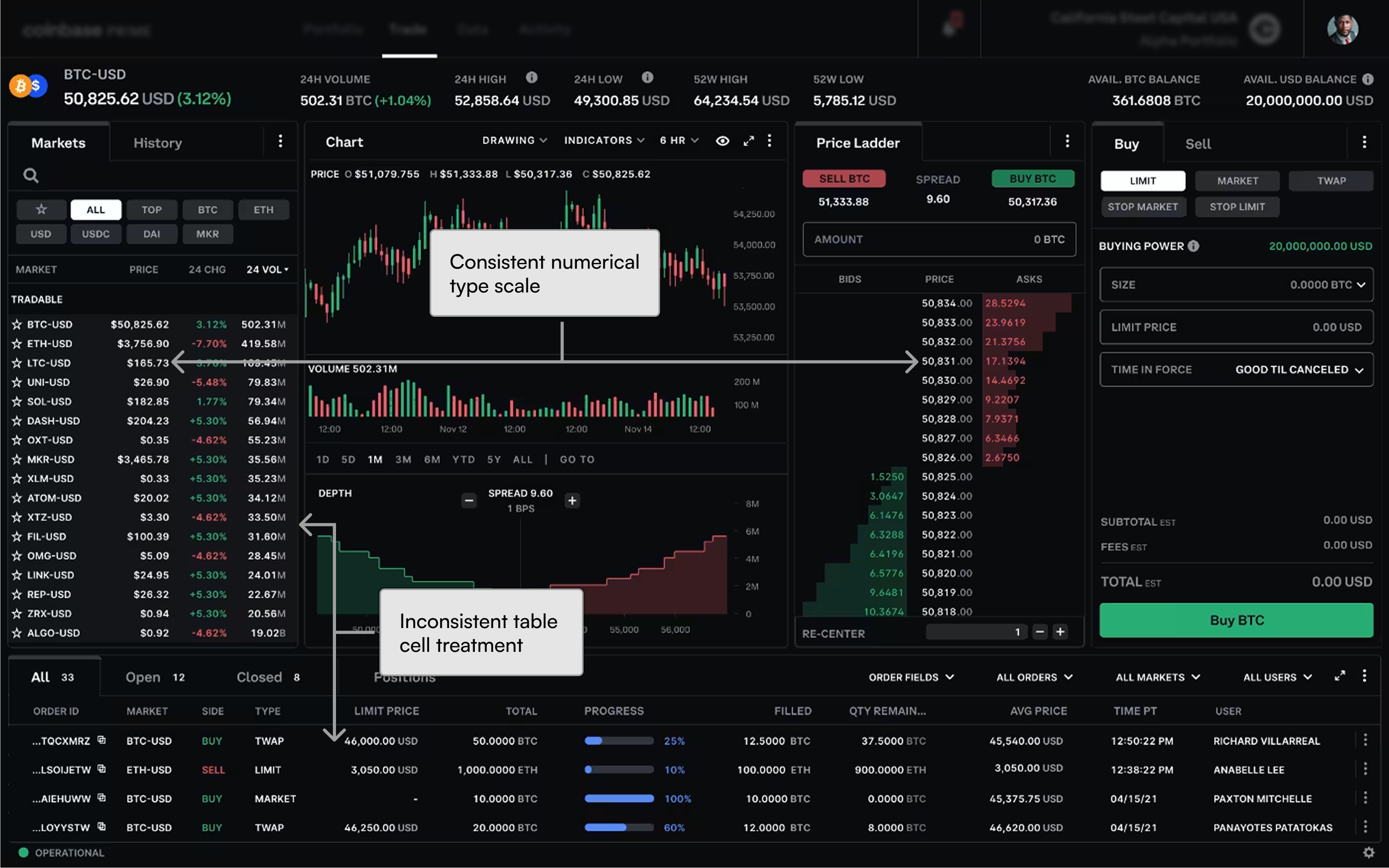
The current state
The legacy platform packed dense data panels into a single view, prioritizing complete information. This approach maximized horizontal spacing for data access and offered institutional traders all the information they needed—but at a cost.
- Density: Moderate to High. Maximizes data per pixel, which traders expect.
- Institutional feel: Moderate to High. Comprehensive data coverage signals credibility and scope.
- Visual polish: Moderate. While functional, the interface showed signs of accumulated design decisions and varied treatments. There was a clear opportunity for refinement.
Competitive context
To validate this opportunity, I examined how other platforms approached similar challenges.
Talos (Bloomberg's institutional offering) maximizes data density with varied price precision and visual hierarchies, delivering a thorough experience for power traders. However, the interface lacks visual cohesion—design treatments vary across contexts, undermining the institutional feel despite comprehensive feature coverage.
Robinhood Legend takes the opposite approach: it shows only essential data for decision-making. Design choices—consistent typography, careful row heights, visual restraint—prioritize clarity and usability. The result feels refined and intentional.
Insights
These two examples highlighted a gap in the market: an institutional platform could deliver both comprehensive data and refined, consistent visual execution. This wasn't a trade-off between depth and polish—it was an execution challenge. The current platform's foundation was strong; it needed thoughtful design systems to scale.
This insight shaped my direction: build a reusable data table system that could maintain consistency across contexts while supporting the density traders require.
Strategic approach
Started with the blotter
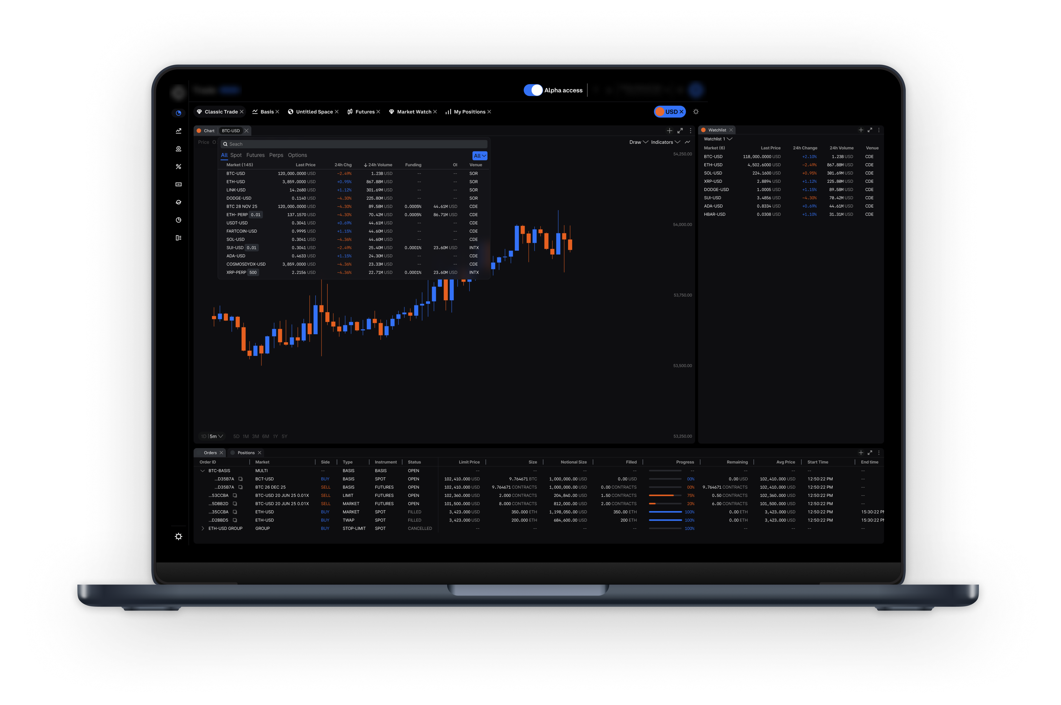
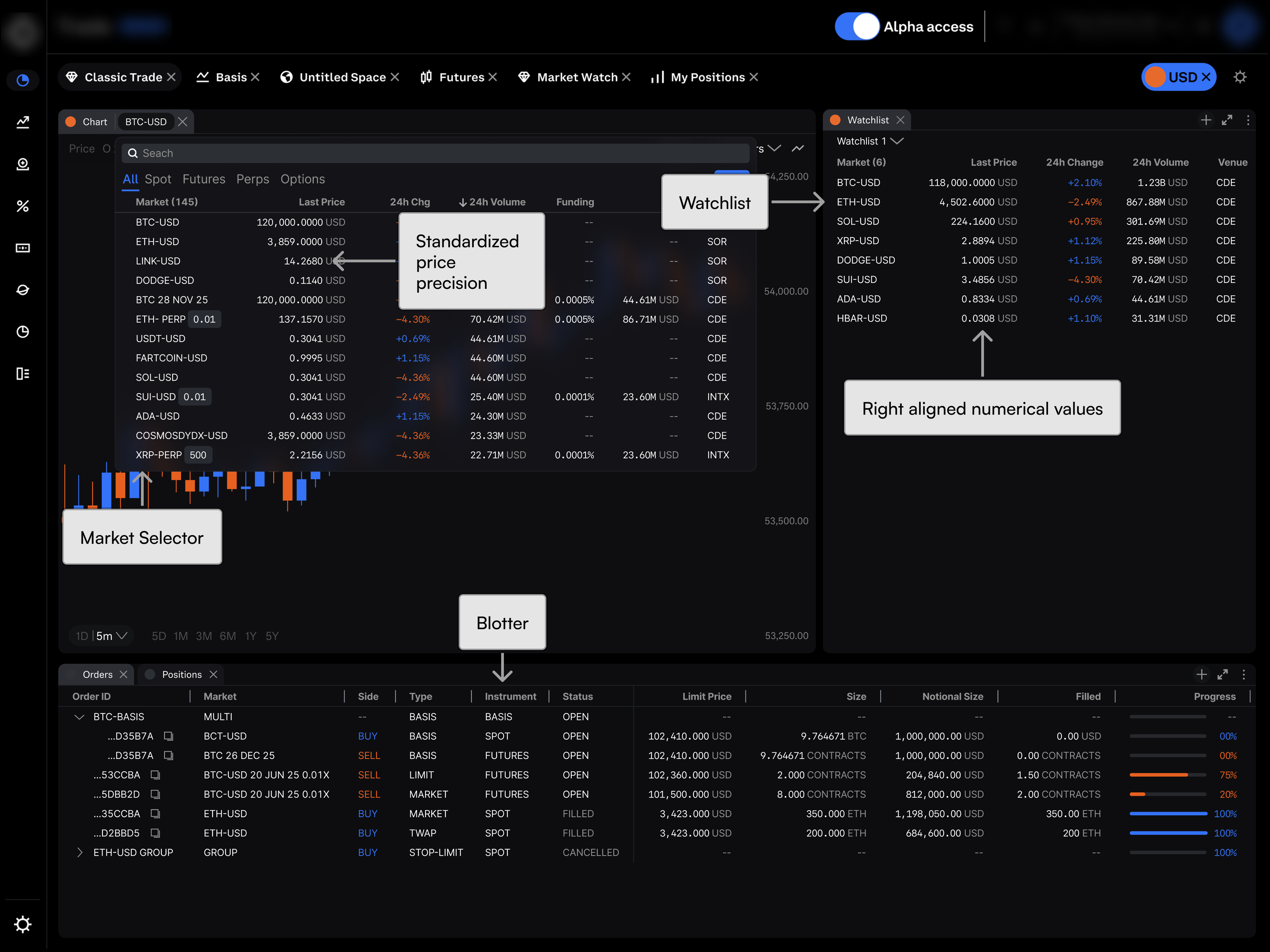
I designed a data table for the primary trading view—where traders manage active positions and execute orders. As I mapped interactions and constraints, a pattern emerged.
Noticed the same structure worked everywhere.
The same core table could also solve the watchlist (market monitoring) and market selector (discovery). Each context had different information priorities, but the underlying table logic was identical.
Reframed three problems as one system.
Rather than design three separate tables, I recognized this as a single system design challenge. One flexible table architecture that could scale across contexts became the strategic direction for the entire redesign.
Why this mattered
This decision was system-level thinking. Rather than solving for one table and living with inconsistency across three, the strategic move was to recognize the pattern and propose architecture that scaled. This became the foundation for the entire design system work that followed.
Design decisions
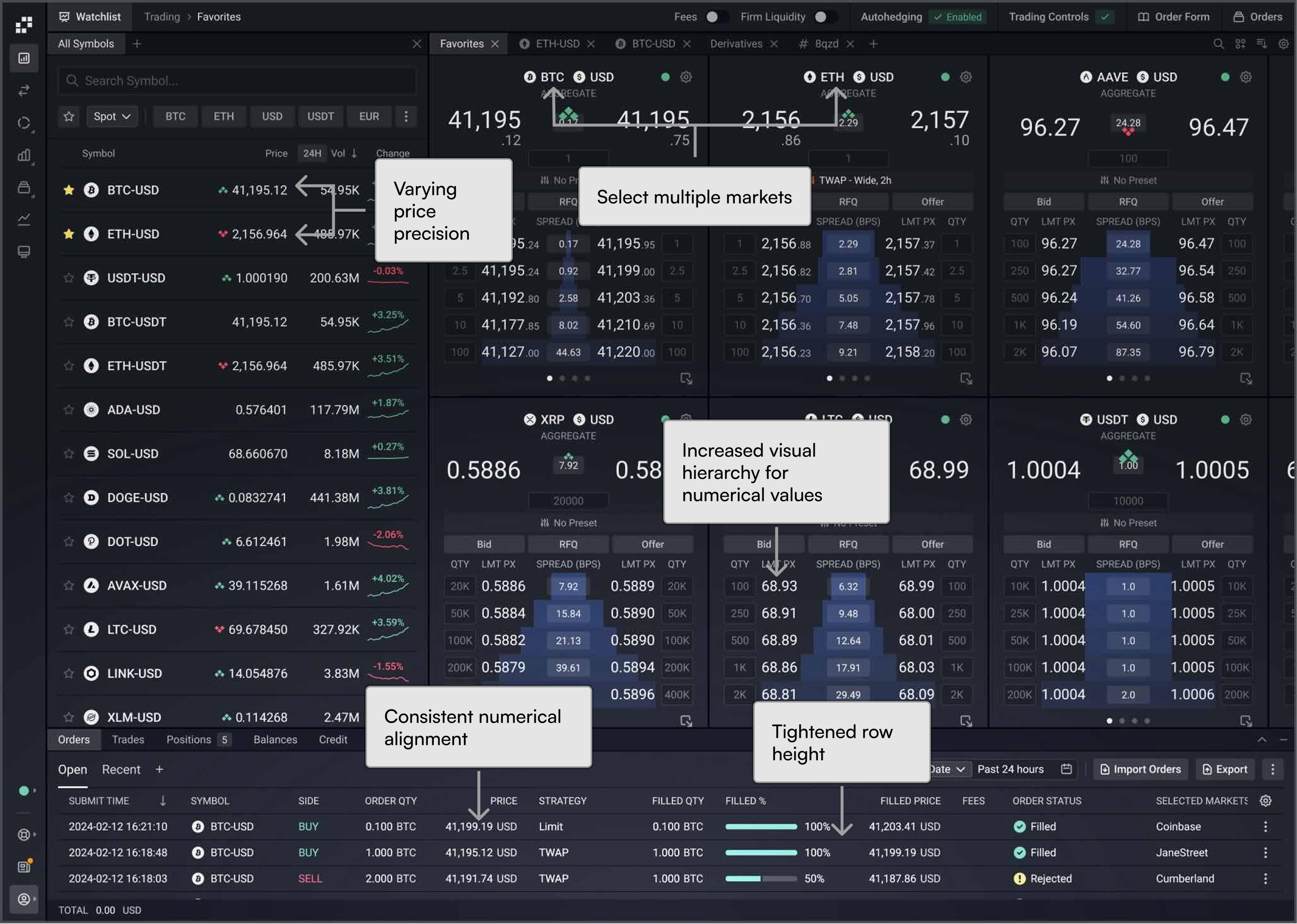
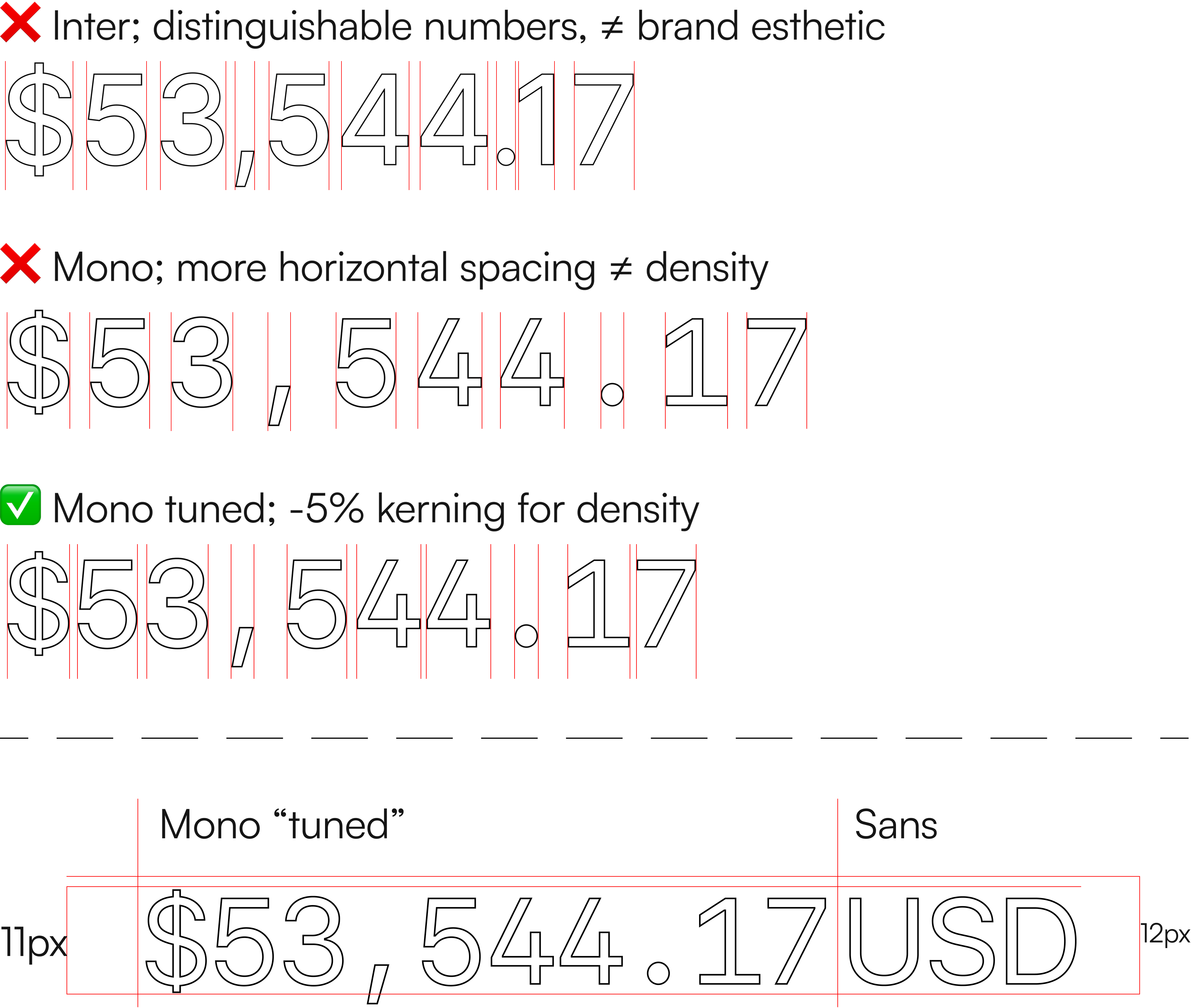
Typography engineering
Worked with Systems Designer to define typography and scale, ensuring consistency and supporting density.
Decision breakdowns:
- Spatial efficiency: Paired monospaced data with proportional Sans labels for clear visual distinction.
- Tuning for density: Tuned kerning to reclaim space while maintaining scannability.
- Line height as bridge: Refined font size and line height to align with spacing increments and enable flexible layout engineering.
Maximizing density
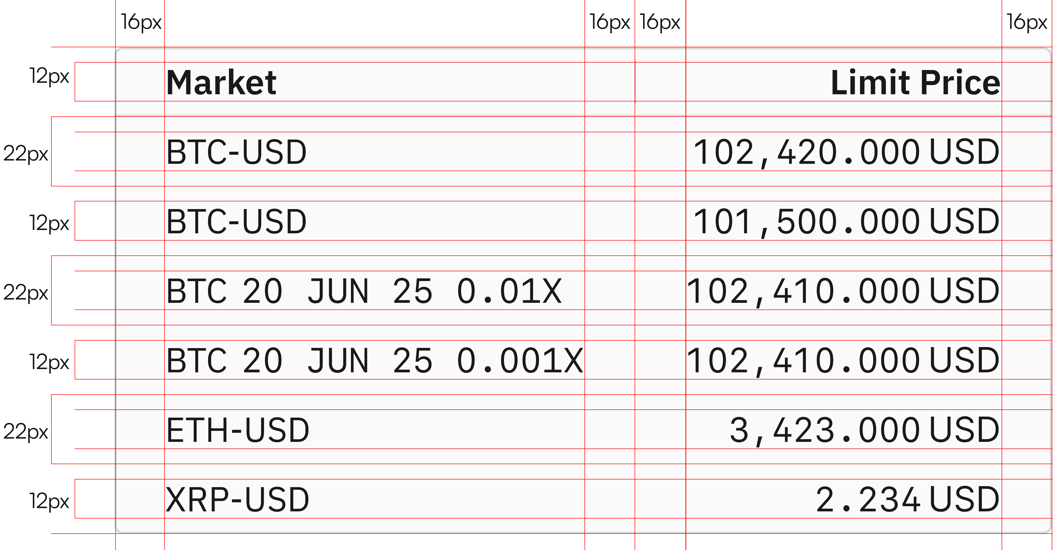
With typography as the foundation, I maximized vertical and horizontal space—enabling traders to see more data at once.
Decision breakdowns:
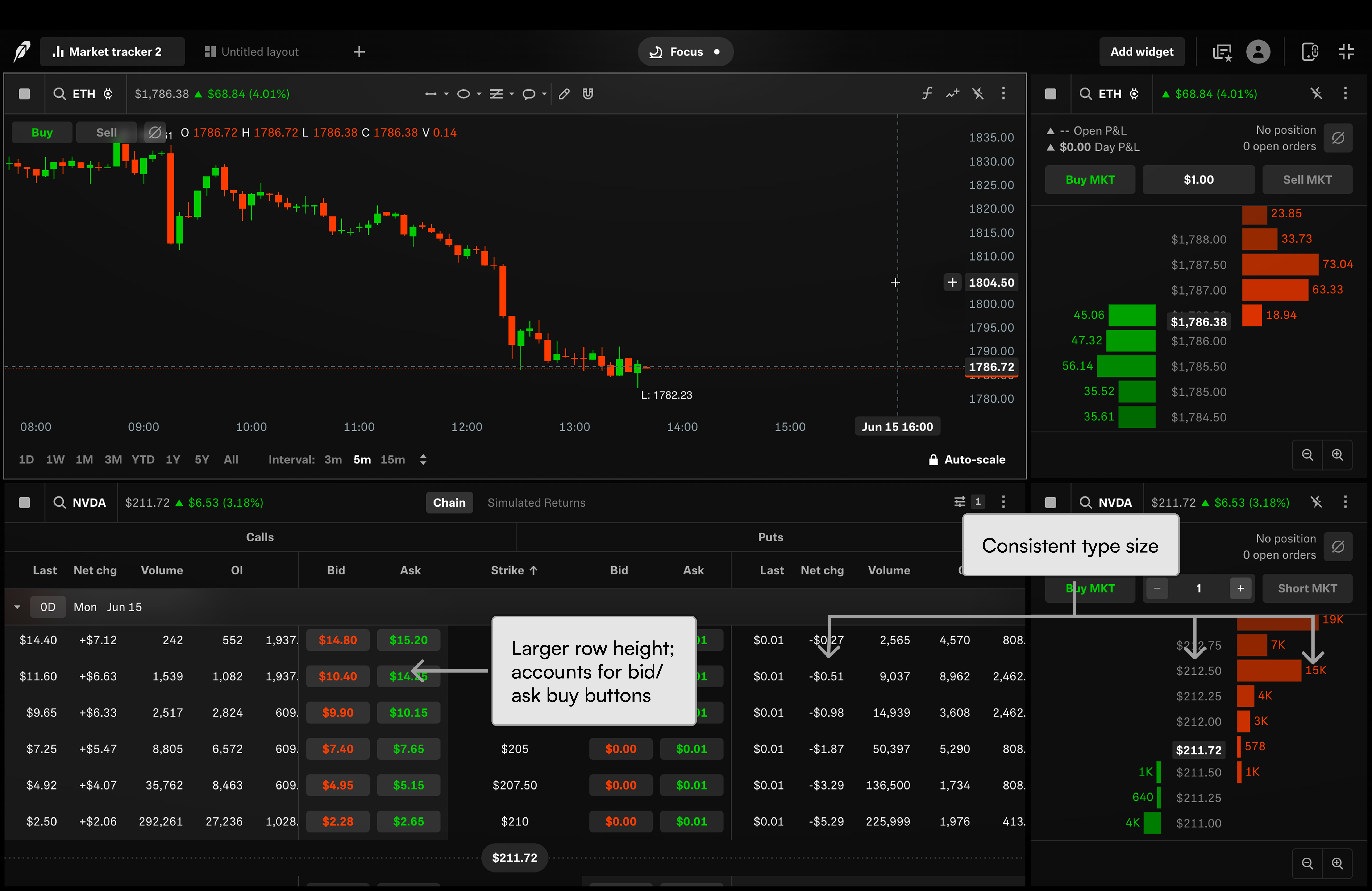
- Height optimization: Established a 22px row height, ensuring cohesive design while maintaining density.
- Grid tightening: Tightened the grid (16px cell padding from longest text string) to maintain density without unnecessary horizontal bleed.
Cohesion at scale
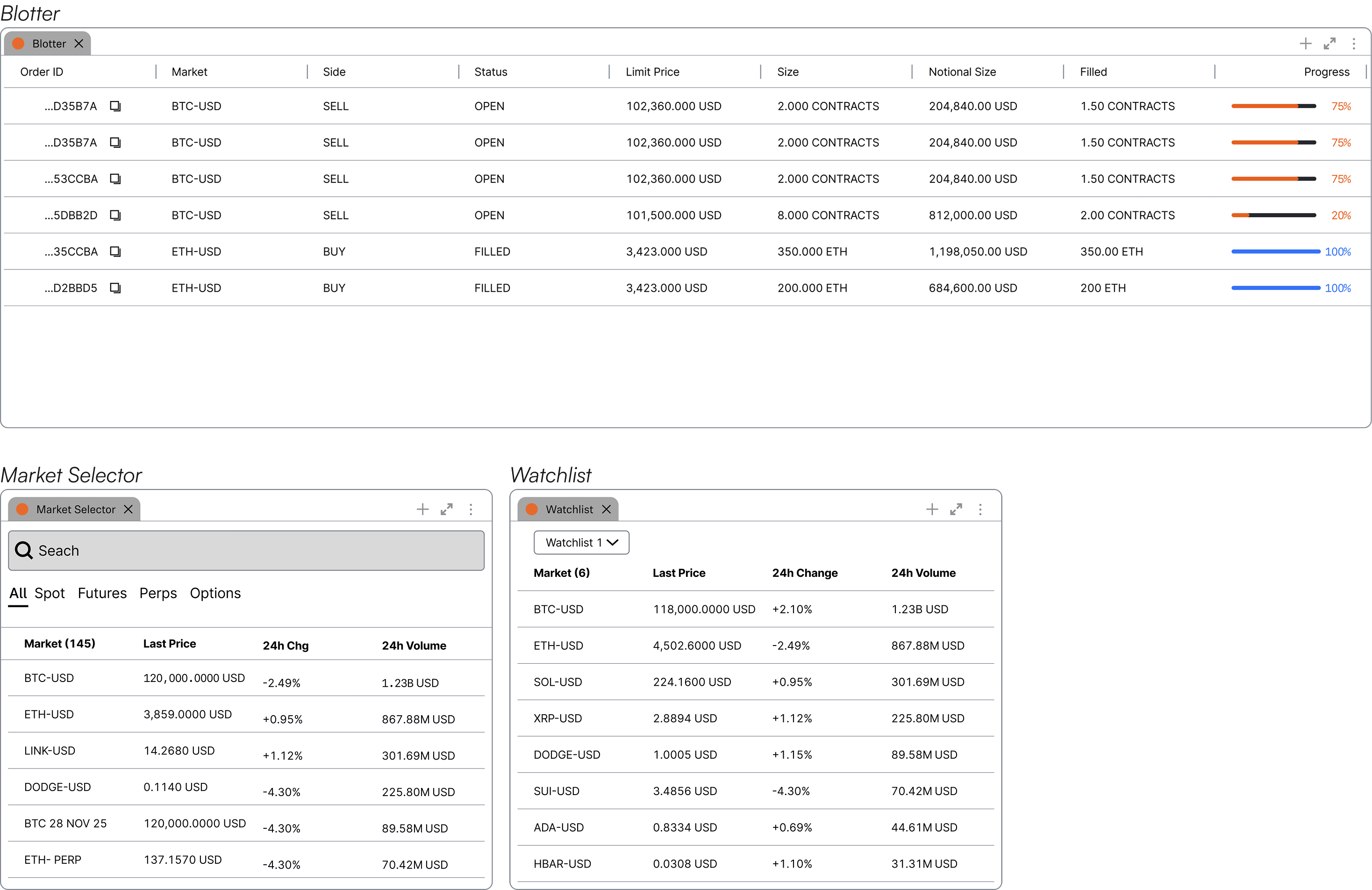
The same data table system maintains visual and functional coherence across the blotter, watchlist, and market selector—proving the architecture scales as designed.
What shipped
Standardized typography, spacing rules, and visual treatments across three contexts. Traders get consistent interactions; design/engineering gets reusable components.

Impact
Stakeholder buy-in for 2 key features
Secured stakeholder alignment on watchlist and market selector architecture—directly enabling the distinctive, differentiated, and own-able experience strategy.
Design system contribution
Contributed 5 design system components including scalable table patterns and typography system for reuse across institutional trade.
Engineering partnership
Architected designs within AG Grid specifications, enabling efficient developer handoff and reducing implementation friction.
Thanks for scrolling!
Discover more of my work!
