
Level 2 insights, seamlessly on the trading chart
Overview
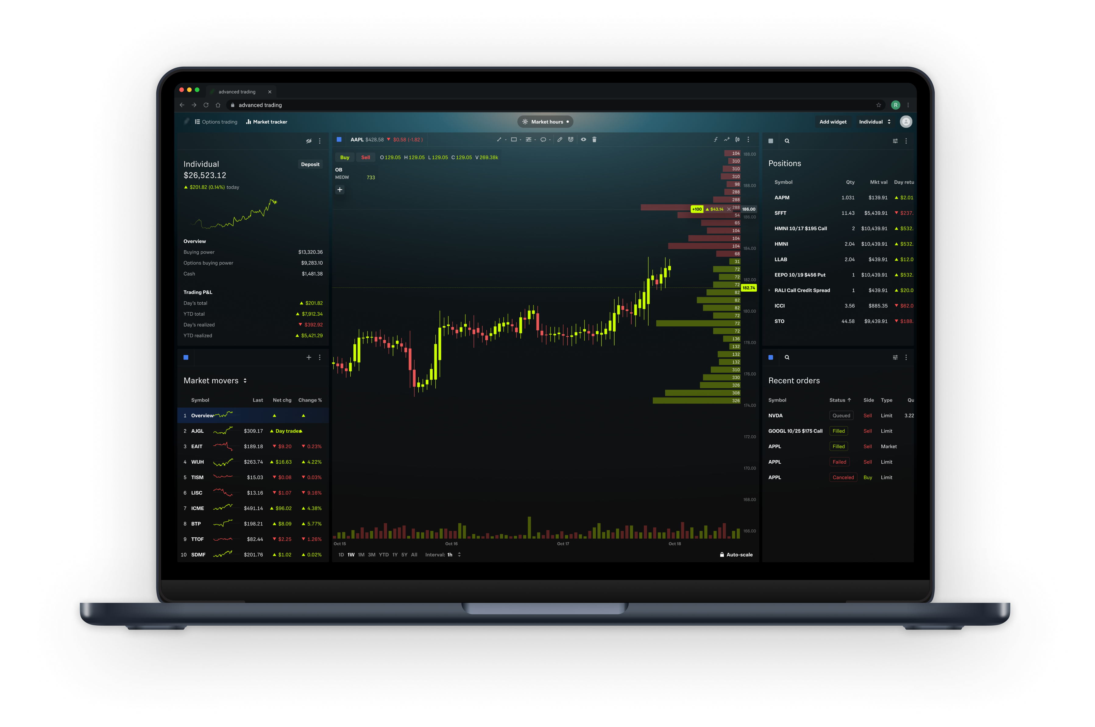
A browser-based trading platform served active traders but lacked order book data—a critical component for analyzing liquidity and price action. I led the end-to-end design initiative to integrate order book data directly into the charting experience, enabling traders to make more informed decisions without switching between tools.
My responsibility was to translate technical financial data into a digestible, intuitive visualization that aligned with traders’ mental models, business priorities, and the broader product ecosystem—including a forthcoming Ladder widget.
Understanding the problem
Our research revealed that ~60-80% of active traders viewed order book data as essential. Users were juggling multiple platforms just to access this insight. Their core needs centered around identifying support/resistance levels and anticipating price movement at key thresholds—all without losing chart context.
Internally, we faced tight technical constraints: real-time data processing limits, a legacy chart system, and overlapping feature development with the ladder widget team.
However, Legend offered no way to access this data. The demand was clear—not only from user feedback but also from internal analytics, which showed a spike in indicator searches for terms like "order book" and "depth of market."
Why does this data matter?
Order book data reveals where large buy and sell orders are sitting on the market. Traders use it to assess liquidity, anticipate price moves, and evaluate breakout potential.
The opportunity
The platform lacked integrated order book data—essential for active traders making high-frequency, high-volume decisions. Competitors offered this functionality natively, and we were seeing attrition among high-value users.
I was tasked with designing an intuitive and performant way to visualize order book data directly within the chart interface.
The goal:
Help users gain real-time liquidity insights without needing external tools. Internal analytics showed a spike in indicator searches for terms like "order book" and "depth of market."
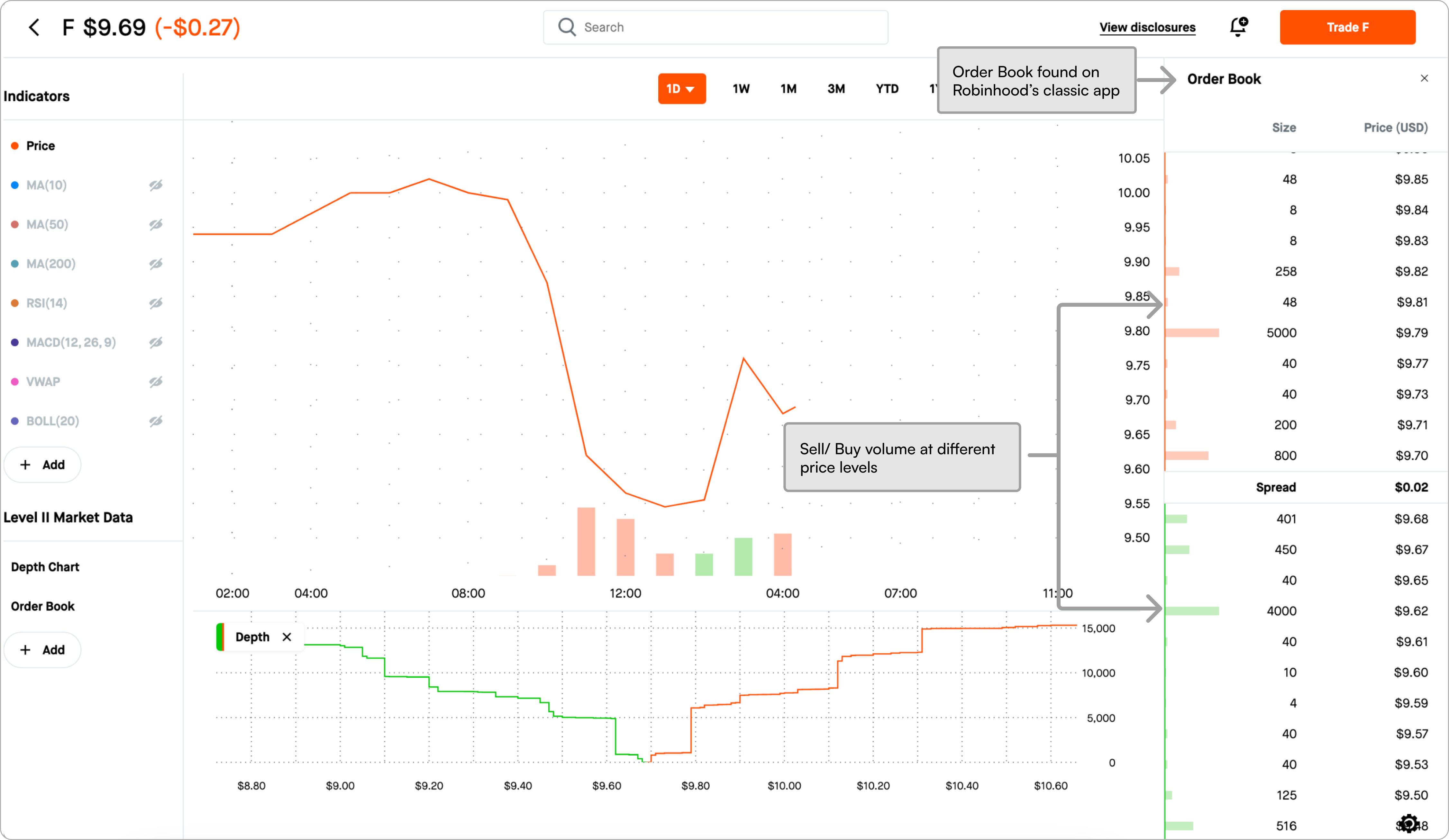
Identifying the Use Cases
Through user feedback and internal product strategy sessions with domain experts, we narrowed in on two primary use cases:
1. Monitor real-time supply & demand
- “I want to monitor supply and demand around the current price so that I know if the price is going to breakthrough or bounce off the nearest level.”
2. Identify support/ resistance levels
- “I want to see where there’s sell volume and buy volume, so I can easily mark areas of resistance and support.”
Grounding strategy in research & collaboration
To kick off the project, I conducted a competitive analysis of top trading platforms to evaluate common UX patterns and uncover missed opportunities. This gave me insight into how other platforms handled order book data—what worked, and more importantly, what didn’t.
Simultaneously, I reviewed customer feedback and social media reviews. A few recurring pain points stood out:
- Fragmented workflows
- Cognitive overload
- Disconnection between market data and price action
This combination of research shaped our direction.
From there, I explored three unique visualization approaches, each designed to tackle the cognitive load and fragmentation we uncovered. After workshopping the concepts with subject matter experts and stakeholders, we aligned on a solution that overlaid aggregated order book data directly on the chart.
This approach preserved users’ spatial context and significantly reduced mental effort—turning complex data into intuitive, actionable visuals.
Strategy & design decisions
Integrated, not isolated
We chose to overlay the order book directly on the chart. This was more intuitive and helped traders act without shifting context or navigating to another platform.
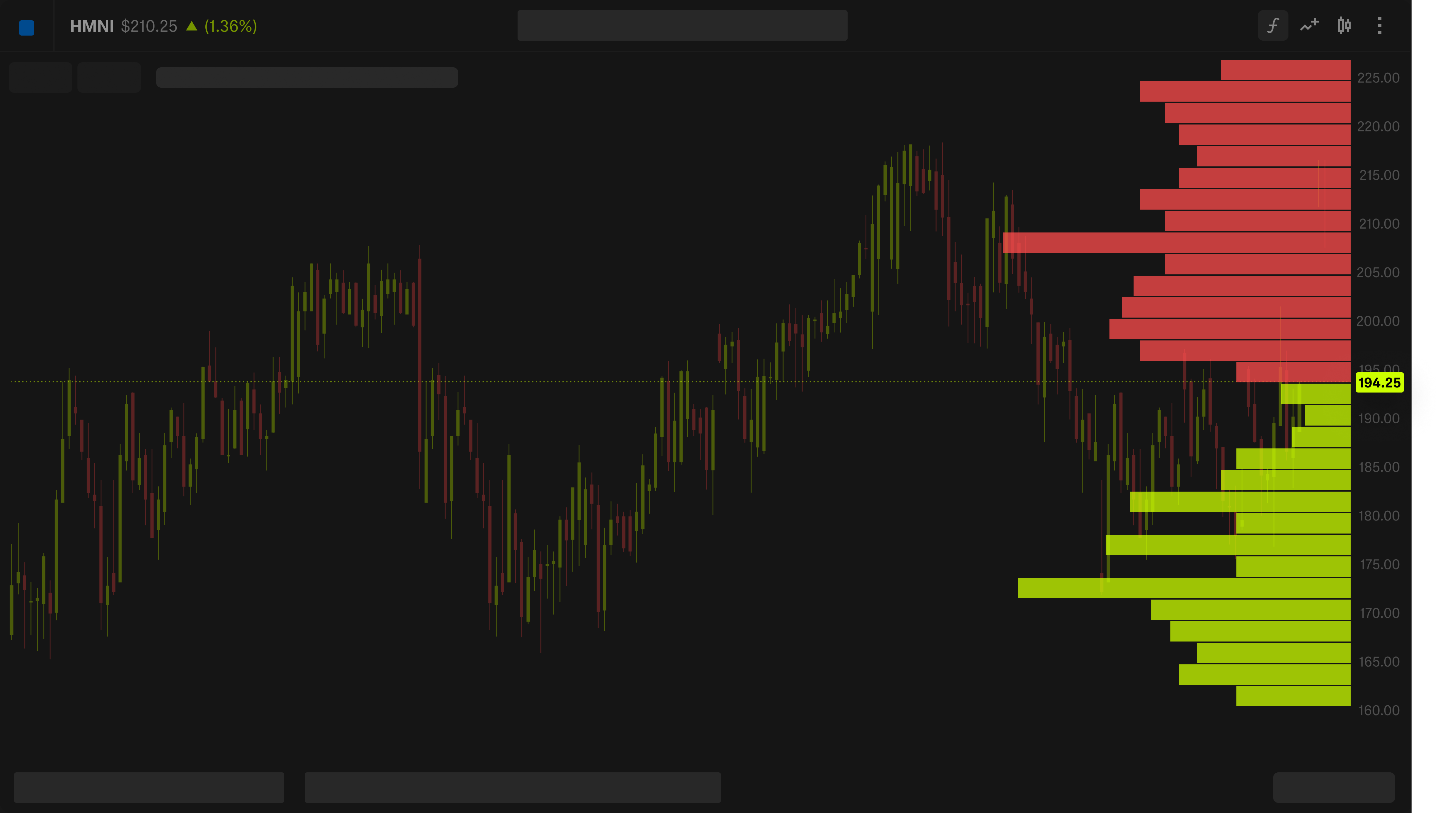
Indicator, not widget or separate chart tool
Since users were already searching for “order book” in the indicators menu, we decided to make it one. This aligned with existing mental models and kept the experience consistent.

Making complex data digestiable
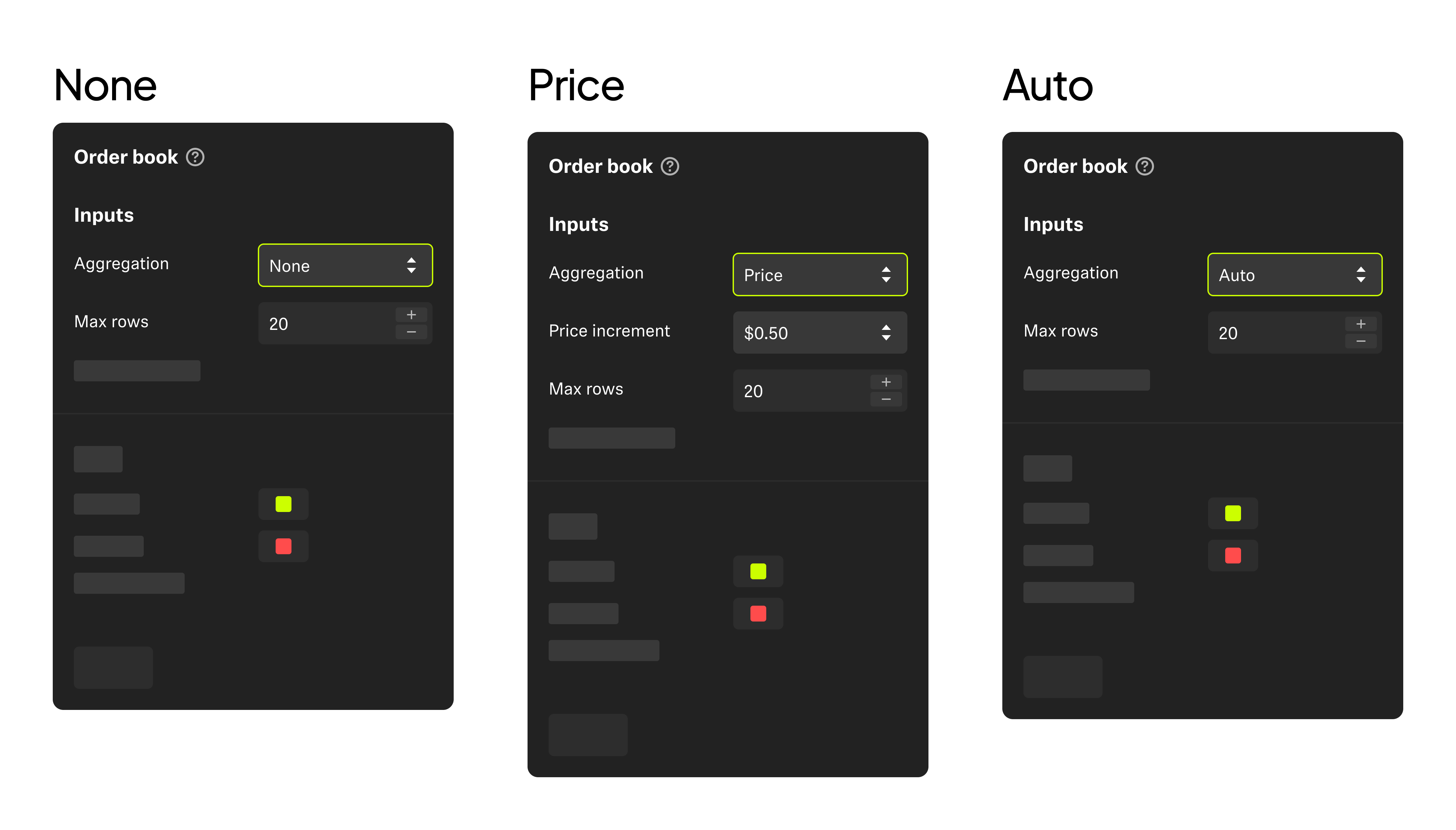
Realizing the orderbook imensity data is up to 200 bid/ask levels per asset, I proppsed To make this more visualizable and approachable for users. I accomplished this by introducing a binning technique (a grouping of order by customizable price increments).
- Users could choose between:
- None: Plot raw data (e.g., $0.01 increments)
- Price: User-defined step size (e.g., $0.50)
- Auto: System-optimized for screen real estate
This made the experience flexible without being overwhelming.
Final Designs
Every detail in the design was tuned for clarity:
- Bid and ask bars anchored directly to their price indicators
- Designing for accessibility; distinct color differentiation
- Smart aggregation logic that scaled cleanly with zoom
- Smooth updates to reinforce a sense of “real-time flow”
Outcomes & Impact
50% Faster Design Cycles
By aligning early with key stakeholders, we cut the design timeline in half and kept delivery ahead of roadmap targets.
Smarter Trades, Less Guessing
Users now had visual clarity on where demand/supply sat—giving them confidence in key price levels.
Validated Strategy
The chosen indicator-based approach complemented (not competed with) the upcoming Ladder widget, reinforcing product cohesion.
Final Thoughts
Designing for traders isn’t just about showing more data—it’s about delivering the right data, in the right way, at the right time.
By grounding design in research, reducing mental effort, and collaborating closely with domain experts, we created an experience that elevated the platform and empowered its users.
Thanks for scrolling!
Discover more of my work!
