Credit Karma to TurboTax
Seamlessly converting Credit Karma customers to TurboTax

Overview
With the Department of Justice orders no longer in effect, tax filing through TurboTax will be available to all of Credit Karma's members.
The goal during tax season was to educate Credit Karma members on the advantages of using TurboTax to file their taxes. We leveraged member data to promote the Refund Advance Deposit (RAD), 5 Days Early (5DE) and simplified tax filing value props, which allows members to receive their refund quickly.
We strived to create personalized and interactive entry points within the Credit Karma platform, to inform members about the tax services available and the ease of accessing their refunds through RAD and 5DE.
Team
Content Design | Product Management | Engineering | Marketing | Analytics | Product Counsel
Role
Product Designer
Company
Credit Karma
The Challenge
Our objective is to ease the tax filing process for 449,000 Credit Karma members by offering them seamless access to TurboTax.
The Hypothesis
Experiment with numerous personalized and interactive TurboTax entry points within the Credit Karma platform.
Understanding
Experimentation Strategy
- Iterate on copy, color and visuals
- Experiment first set of variations against last year’s winning design during Peak 1 (First half of tax season).
- Experiment next set of variations against Peak 1’s winning designs during Peak 2
Understanding
What’s the flow to TurboTax?
Before diving into the design phase, it was crucial to get alignment among key stakeholders. This alignment spanned across Product, Design, Marketing, Engineering, and Analytics, all of whom needed a crystal-clear understanding of how our members would embark on their TurboTax journey. Meticulously mapping out every entry point available to our members.

This alignment served two purposes. First, it allowed us to address any doubts about the relevance and user-friendliness of these entry points. We had an idea for the member journey, but did it resonate with our members? If not, why? Do we take members directly to TurboTax or let them enter the Taxes and Income tab first? And were there any potential challenges associated with the questionable entry points? Warranting consideration moving forward with these questionable entry points.
Additionally, this kick-started the collaboration between the Marketing and Design teams. Offering valuable insights into where and how Marketing intended to position their content. Ensuring that when Content Design and myself paired, our designs would be seamlessly integrated with Marketing's messaging, avoiding redundancy and delivering a more cohesive user experience.
Understanding
The Entry Points to TurboTax
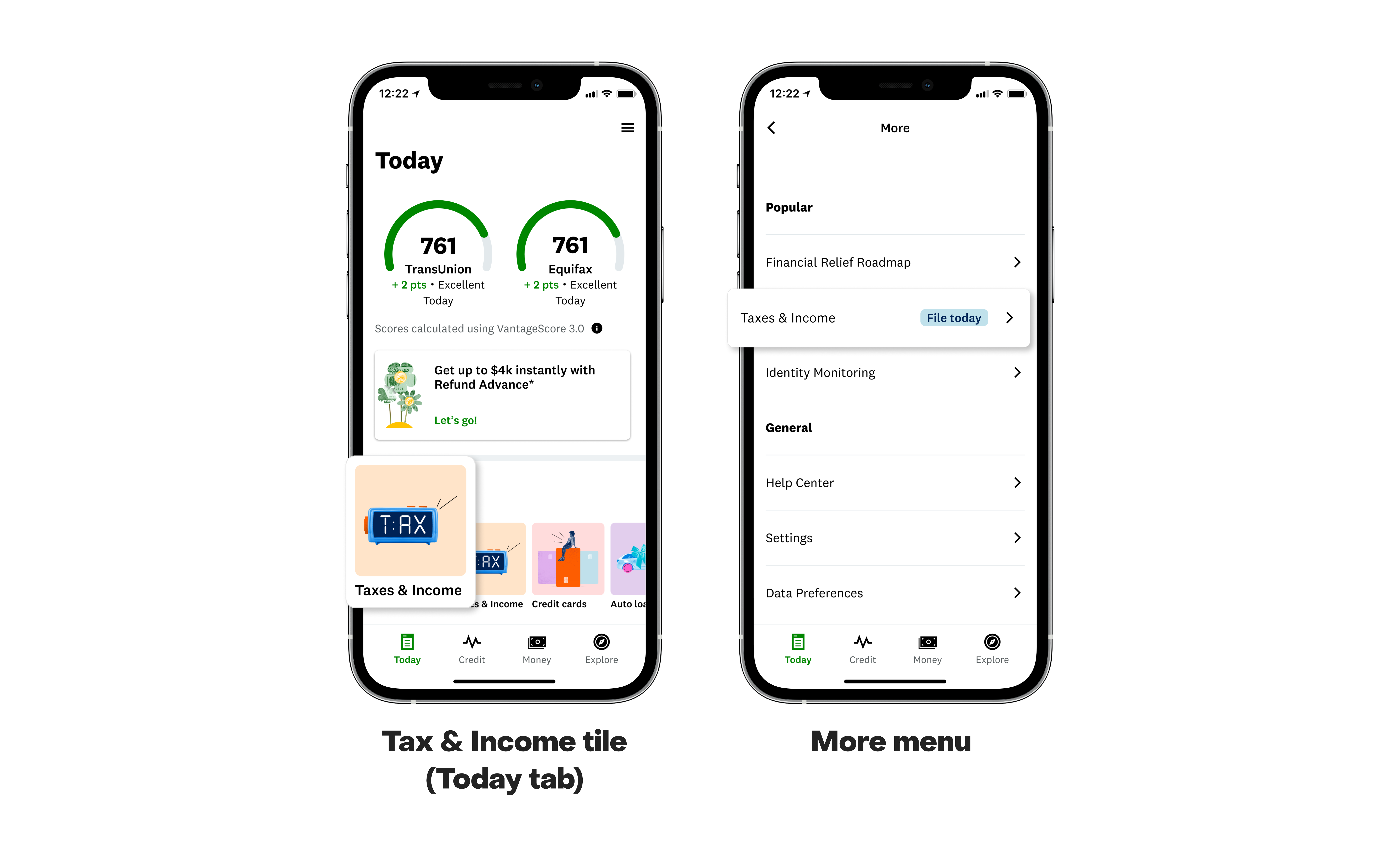
I aimed to iterate on multiple entry points within the Credit Karma app, making them more prominent and eye-catching to attract members' attention.

Entry Points to TurboTax
Homepage Tile and More Menu
Directly to TurboTax? or Income and Taxes?

Entry Points to TurboTax
Tax & Income Insights Page and Tax Landing Page
Promote special offerings provided by TurboTax.

Problem
Having multiple personalized and interactive entry points to TurboTax can make it challenging to monitor what resonates and what doesn't resonates with Credit Karma users.
Solution
A methodical approach to designing various components with different content will streamline experiments to identify what resonates most with Credit Karma users.
The Approach
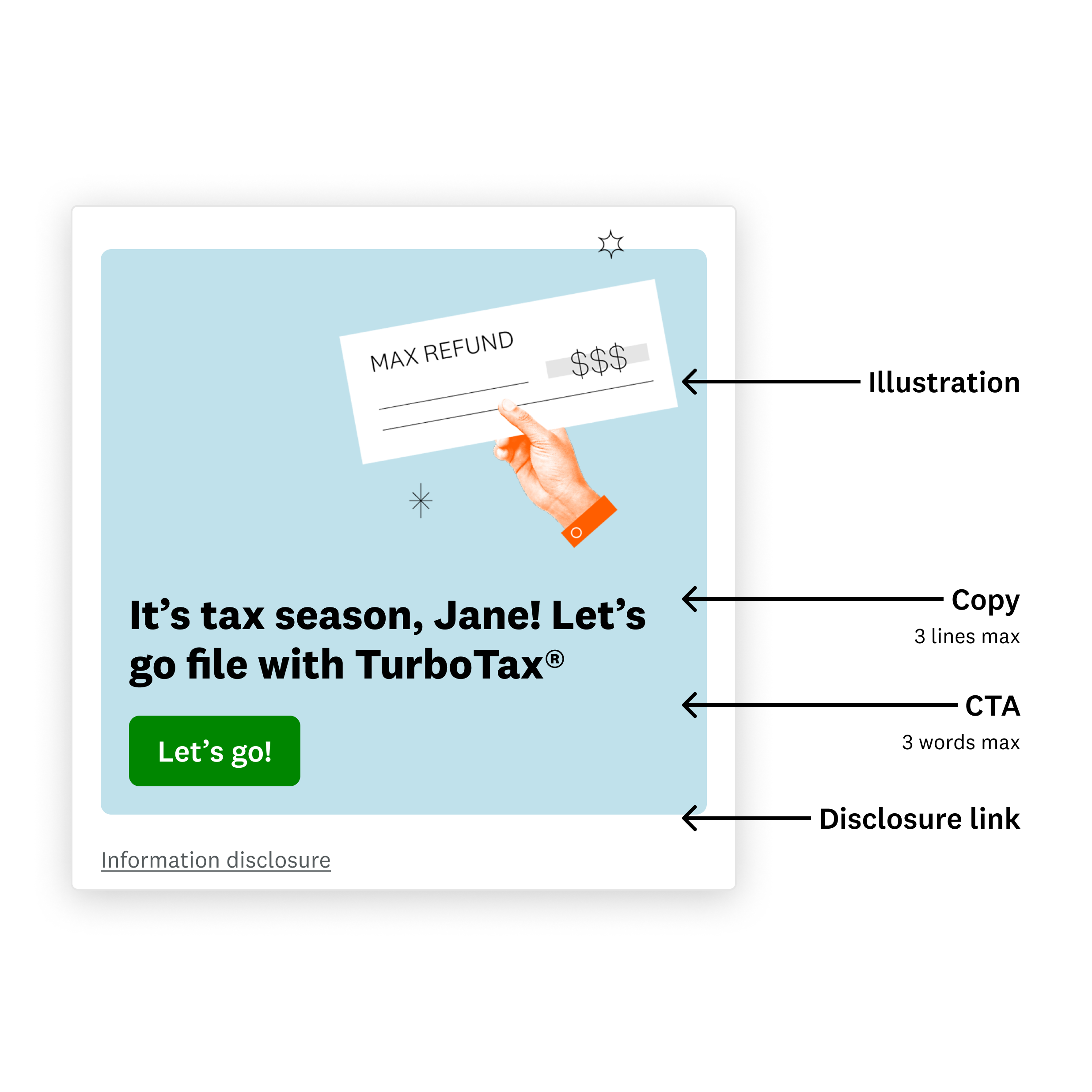
The Detailed Structure of Components
To avoid design chaos and ensure a structured approach, I chose to break down each component into individual elements before proceeding with multiple iterations. This allows me to be more organized and make iterative changes based on feedback more efficiently.
The Approach
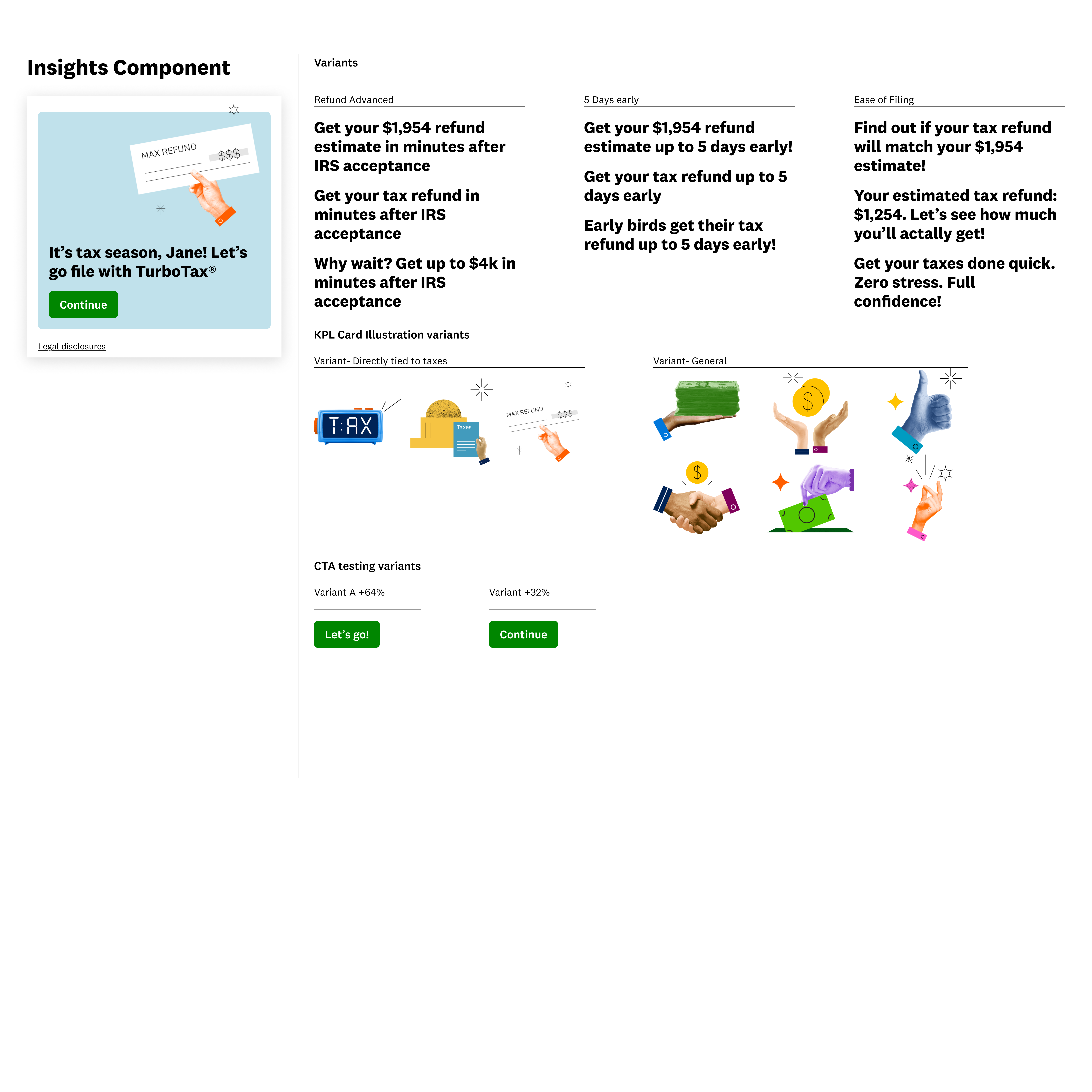
The Assembly of Content
Decomposing each component into its individual elements enabled me to focus on each element's design and content independently, free from the distraction of other elements. This facilitated a more thorough iteration process for each element, leading to better results.When designing our content, I had to consider the various entry points for our members. Reflecting on the member journey the team had agreed on, I was able evaluate the unique value propositions. Allowing me to craft the story in a way that would incline members to file their taxes
When designing our content, I had to consider the various entry points for our members. Reflecting on the member journey the team had agreed on, I was able evaluate the unique value propositions. Allowing me to craft the story in a way that would incline members to file their taxes.
TurboTax Considerations
I also had to think think about the Refund Advance, 5 Days Early and Ease of filing value propositions. Value propositions that would be used for Insights Component and Tax Intent Landing Page. These were TurboTax's offerings to help entice members to file their taxes.

**Content reduced for visual purposes.
Reassembling the Components
Taking a deliberate and methodical approach, set the foundation for a fast-paced design process. Once I had all the necessary content, I was able to quickly and efficiently create a plethora variations and iterations. Mixing and matching the predetermined content and visuals.
The Experiment
Having a vast array of designs for each entry point provided us with the opportunity to swiftly curate a selection of designs to be launched for experimentation. Allow us to multiple groups of designs for each entry point. If needed, I'd be able to make minor changes to the designs based on the data we collected.
The Seamless Journey to TurboTax


