
Synced drawings for technical advanced traders
Overview
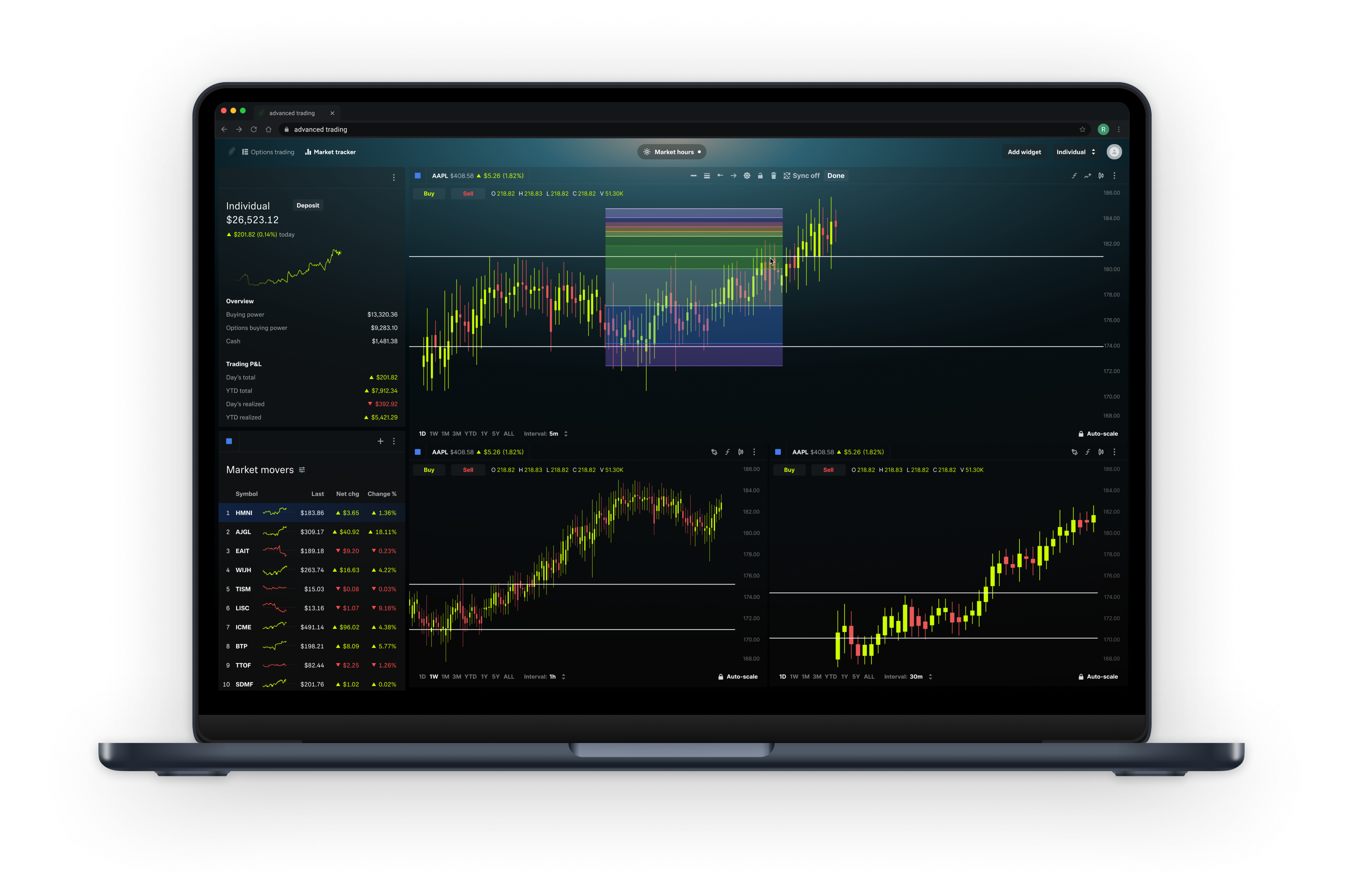
I led the design of a feature that made technical analysis feel seamless: Synced Drawings. This functionality allowed traders to mirror their annotations (like trend lines and support levels) across all charts tracking the same asset — removing friction, building trust, and moving our platform closer to parity with best-in-class tools like TradingView.
The challenge was deceptively simple: “Make drawings appear across multiple charts.”
But delivering that experience — in a way that was intuitive, technically feasible, and respectful of how power users think — took systems thinking, close collaboration, and an obsession with detail.
Role:
Product Designer — led interaction design and visual strategy.
Timeline:
2 months
Understanding the Problem
At the time, the platform's charting tools supported drawing overlays — like support/resistance lines or Fibonacci retracements — to help users perform technical analysis. However, these annotations were bound to the specific chart widget they were created on.
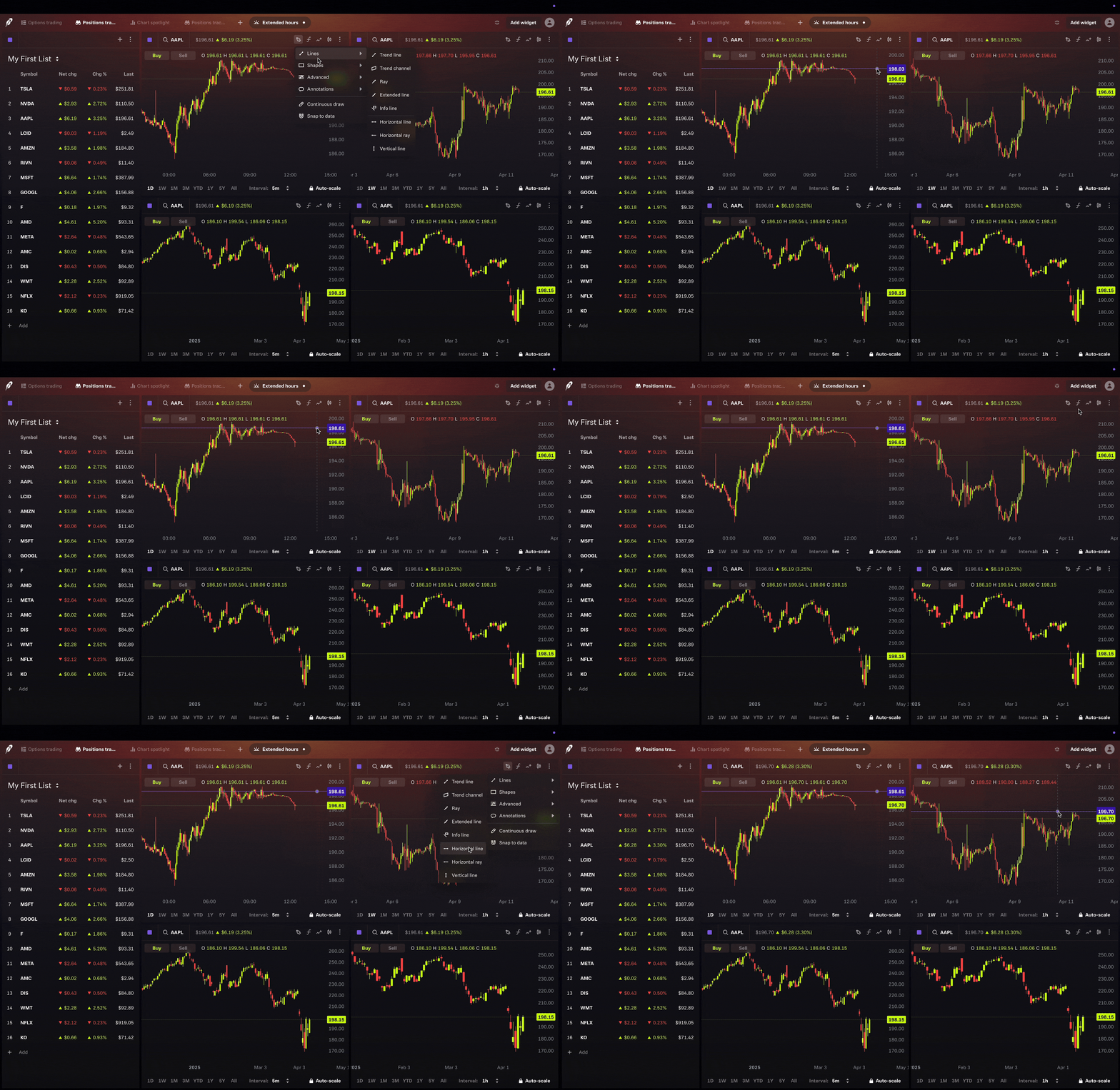
Even when analyzing the same symbol (e.g., AAPL) across different charts or layouts, users had to redraw the same insights multiple times. There was no way to sync drawings across charts of the same asset.
This behavior introduced clear friction:
- Redundant work
- Risk of inconsistency
- A growing sense the platform's tools weren’t tailored to active traders
Most importantly, it contradicted a natural mental model:
“If I’m analyzing AAPL, I expect to see the same drawings — no matter where I’m looking.”
While technically accurate from a system behavior standpoint, it failed to align with how traders mentally model their tools — highlighting an opportunity to rethink how drawings behave across surfaces.
Framing the Opportunity
Through early synthesis of user feedback, competitive analysis, and social media tutorials—and in close partnership with Product—we identified two core user needs:
- “I want certain drawings to show up across all my AAPL charts.”
- “But I don’t want every drawing to appear everywhere — some are temporary or layout-specific.”
Informing us that a simple global toggle wouldn’t be enough. Users needed granular control, and the platform needed symbol-level awareness.
This reframed our design challenge:
How might we give users seamless sync behavior that respects their intent — without breaking their flow or overwhelming them with complexity?
Exploring the Right Interaction
I mapped and prototyped a few primary options:
Option 1: Global toggle in chart settings
- ✅ Aligned with power-user mental models- allowing to set default preference
- ⚠️ Too hidden for most users and
- ⚠️ Defaults can’t be overridden
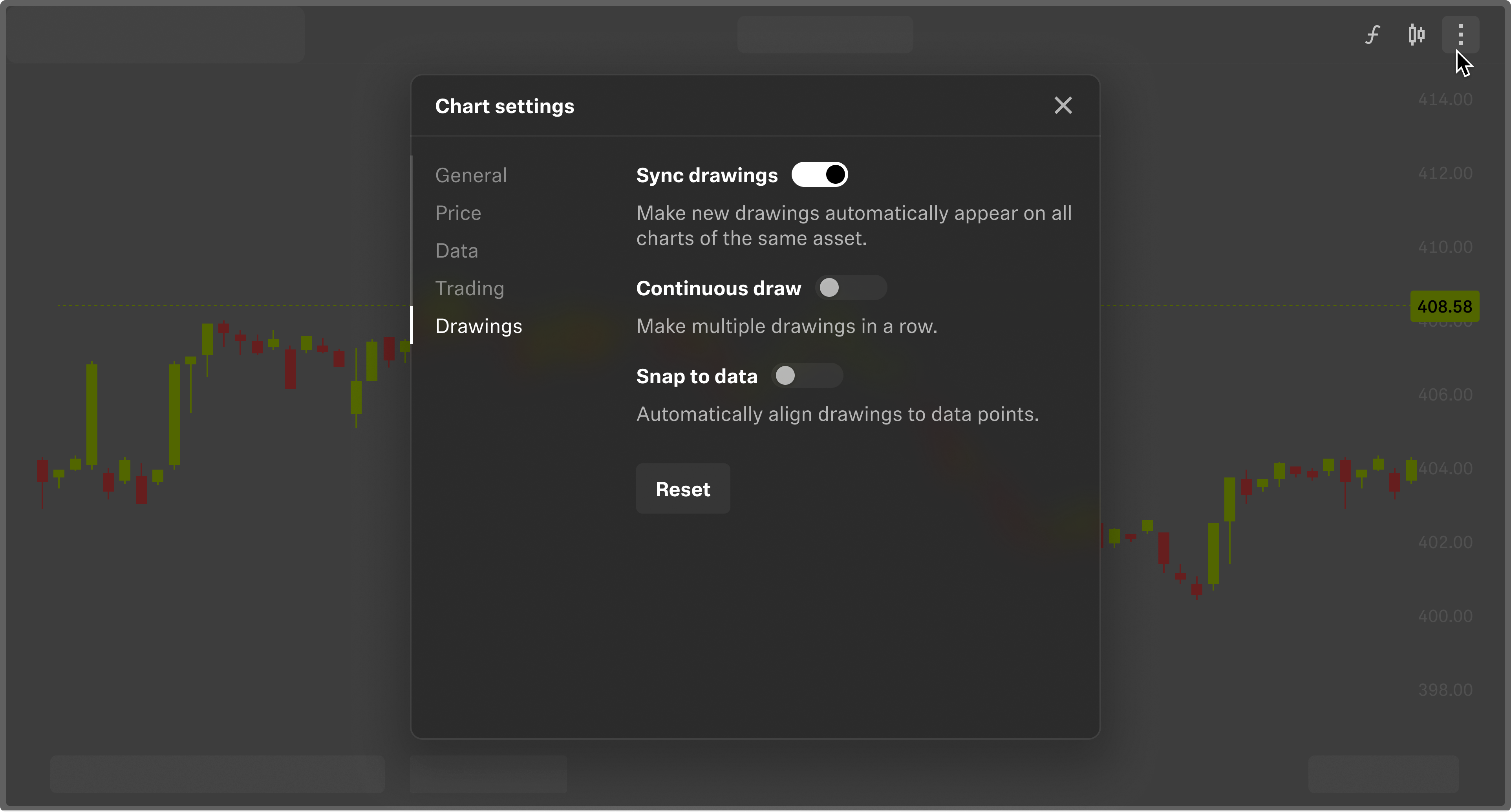
Option 2: Widget-level control
- ✅ Highly visible
- ⚠️ Introduced UI clutter in a space where real estate matters
- ⚠️ Unique interaction pattern

Ultimately, a dual-layer model was recommended:
- A global chart-level default for quick setup
- A per-drawing override for fine-grained control
This offered flexibility without overwhelming new or occasional users.
A Technical Pivot
Mid-project, Engineering raised an important constraint:
Syncing drawings across widgets as-is would require duplicating drawing data across layouts — introducing performance concerns and sync complexity.
Rather than compromise the experience, I initiated a reframing session with Engineering and PMs. We landed on a new architecture:
- Drawing instance: Local, unsynced by default
- Widget instance: Synced across charts sharing the same symbol
- A “last used behavior” pattern to preserve user preferences and reduce toggle fatigue
This decision preserved UX integrity while reducing long-term tech debt — and it became the foundation for future charting behaviors.
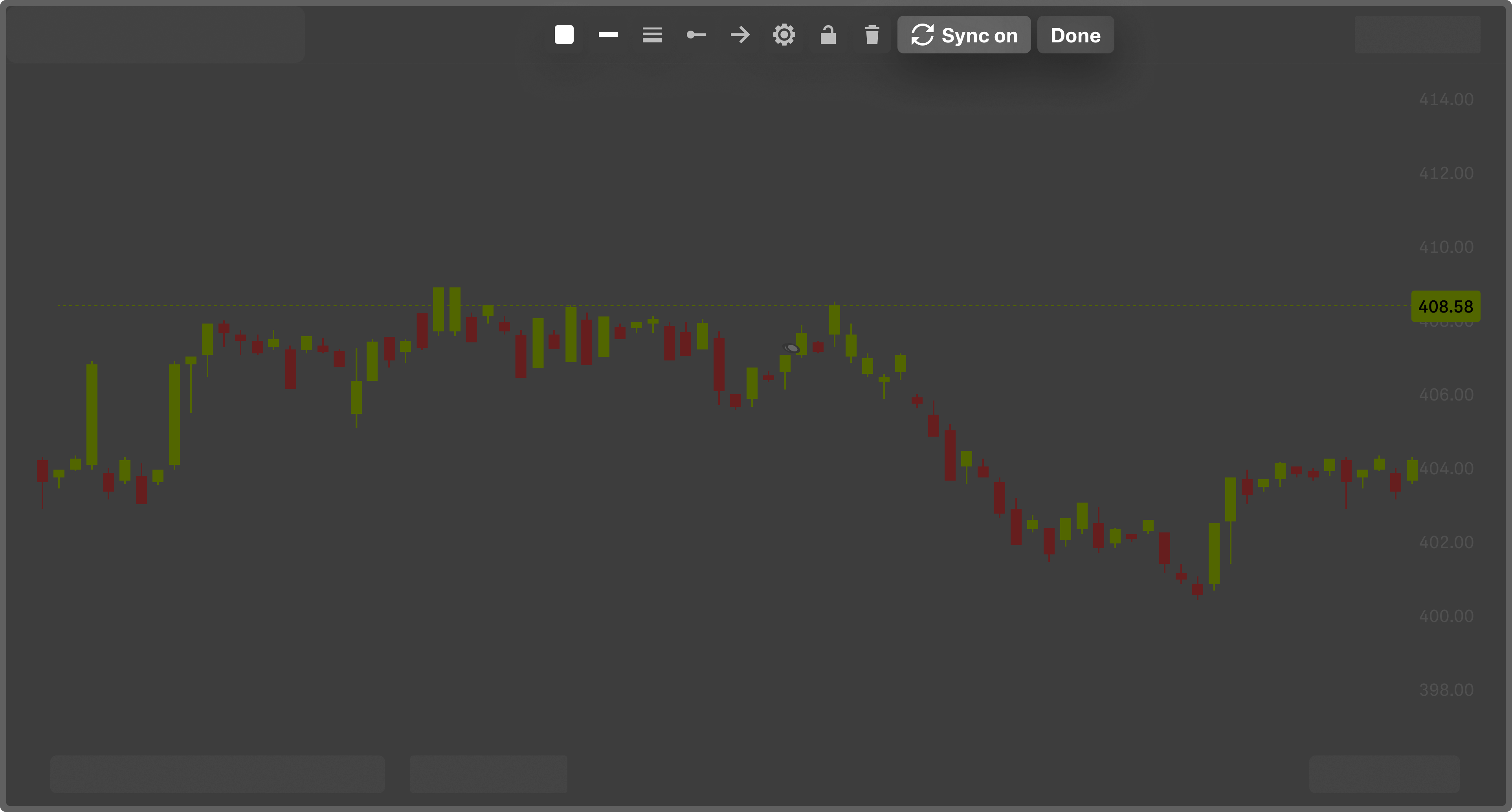
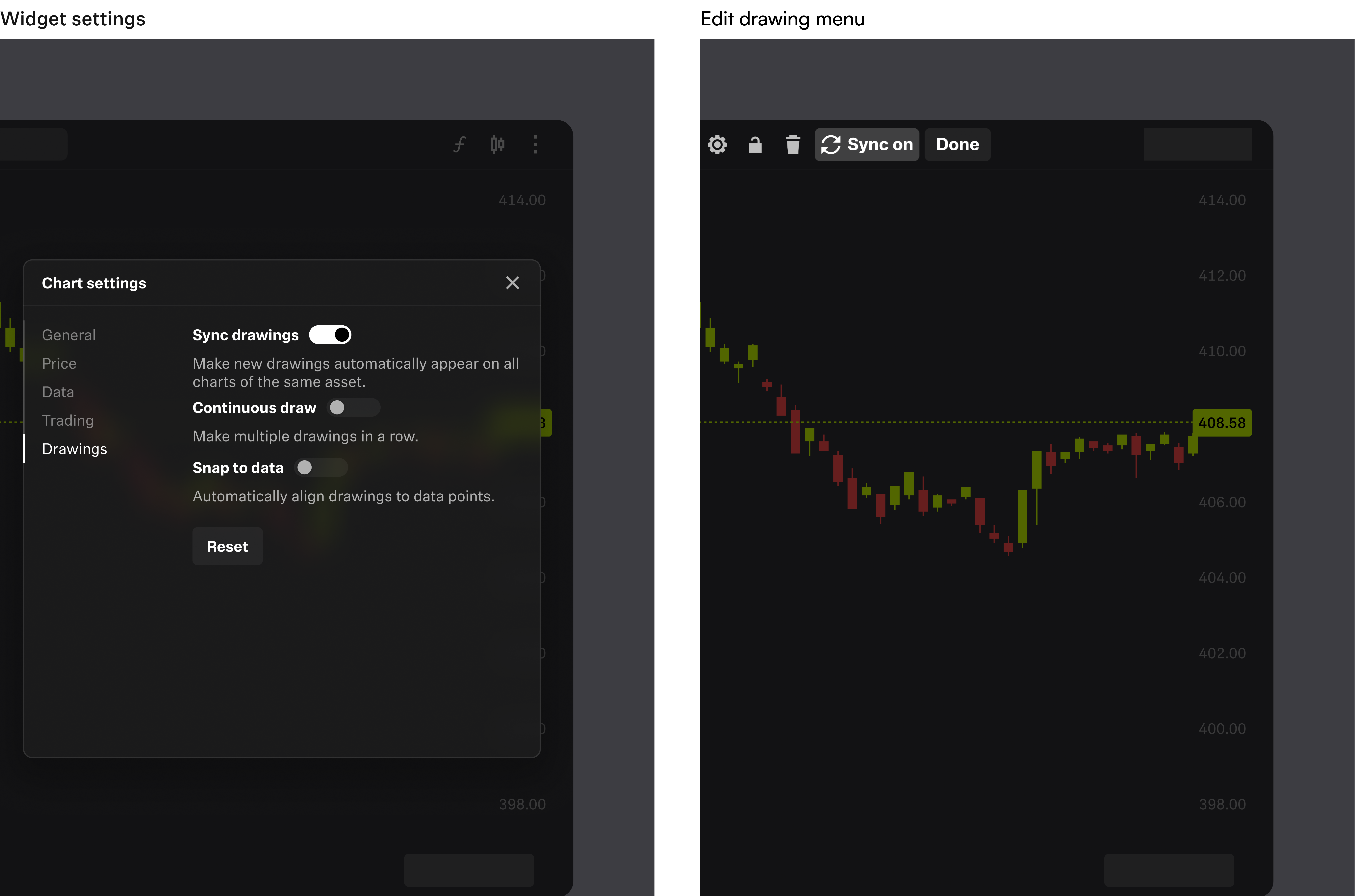
As part of this work, I introduced a new design system component:
- New visual states and affordances added to the drawing edit menu
- Design system updates to support synced vs. unsynced visual patterns
Making Synced Drawings Discoverable
Even the most intuitive features need just enough framing.
To ensure users understood synced drawings without getting in the way, I designed:
- A first-time-use modal introducing sync behavior
- A release note surfaced through Notification Center

What We Shipped
We delivered an experience that:
- Allowed drawings to sync across charts of the same asset
- Gave users per-drawing and global control
- Provided immediate visual feedback and status clarity
- Preserved performance and engineering scalability
As a trader, I want to draw support and resistance levels on my TSLA chart so that I can visually track key price zones and have them automatically saved and synced across all my devices.
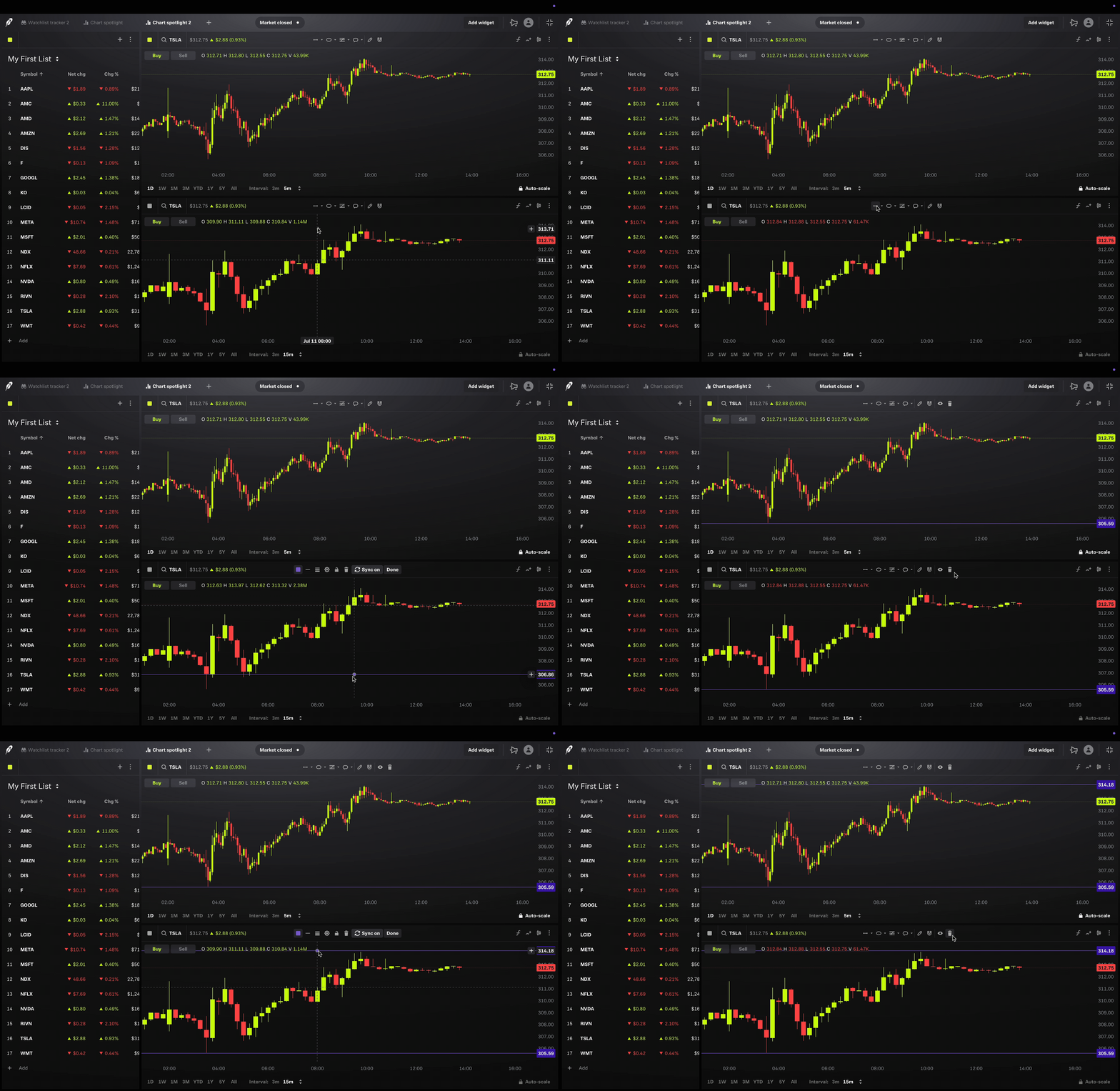
As a trader, I want to draw a Fibonacci retracement on my TSLA chart, but I don’t want it to sync across my other charts, so I can keep my workspace focused and avoid clutter on unrelated views.

Impact
Takeaways
This project reminded me that small, system-level enhancements can quietly unlock big user value.
What I'm proud of:
- Turning a vague request into a thoughtful, scalable UX pattern
- Balancing flexibility with simplicity
- Leading the cross-functional conversations that helped us ship with confidence
What I would do differently
- Usability testing earlier in the prototyping phase — especially around discoverability
- Better support for edge cases (like synced drawings across saved layouts or browser tabs)
Thanks for scrolling!
Discover more of my work!
